
Webinar Planning
Webinar Registration Page: What to Include to Earn Sign-Ups
Build a webinar registration page that makes the value, details, speakers, and next step clear before a visitor has to decide.
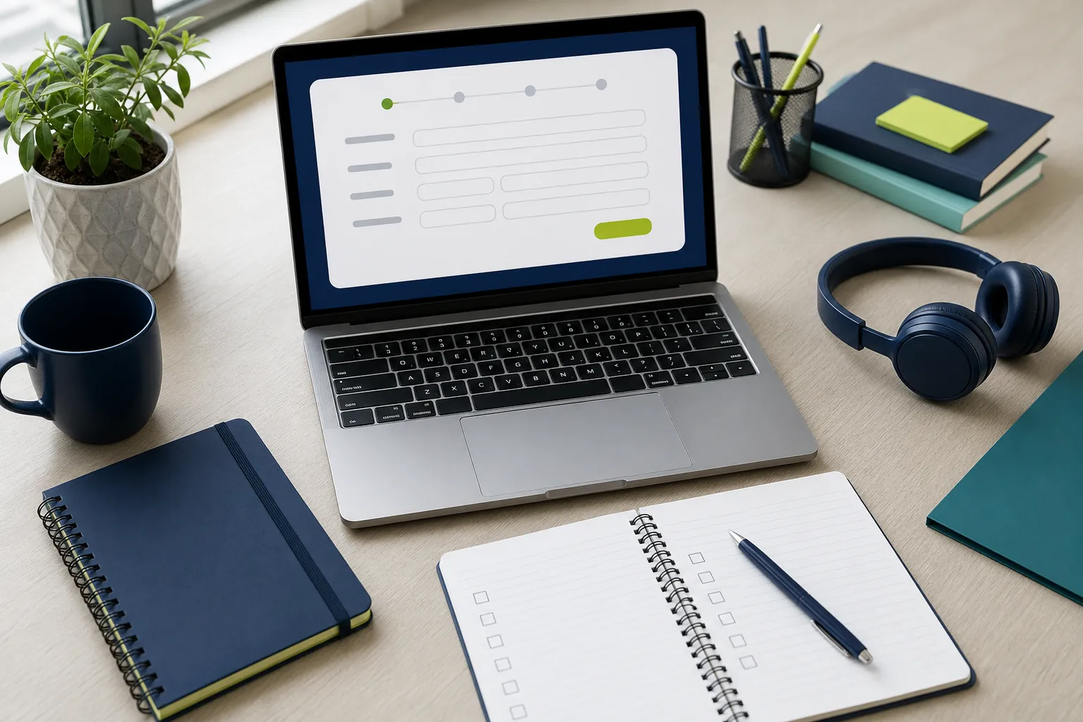
A webinar registration page has one job: help the right person decide that giving you their time is worthwhile. It is not a place to tell the whole company story or list every feature of the event platform. It is the page that turns a promising topic into a calendar commitment.
That decision happens quickly. A visitor wants to know what they will get, whether the session is meant for them, when it happens, and how hard it will be to join. Give clear answers in that order and the page becomes much easier to act on.
This guide explains what to include on a webinar registration page, how to make the form feel reasonable, and what should happen after someone signs up. Use it for a customer education session, a product demonstration, a training event, a panel, or a recurring webinar series.
Start with one concrete outcome
The strongest registration pages lead with a result, not a broad event label. "Learn how to prepare a 30-minute customer training webinar" is more useful than "Join our webinar about customer success." The first tells a busy visitor what they can use when the session ends.
Write the outcome before you choose the headline. Ask what a good attendee should understand, decide, or be able to do afterward. Then make that promise specific enough to recognize. A product webinar may promise a live walkthrough of one workflow. A panel may promise a practical view of a decision. A training session may promise a repeatable process.
Keep the promise aligned with the event itself. A clever title can earn attention, but it will not help if the agenda delivers something else. The webinar planning checklist can help you settle the audience, objective, roles, and format before you publish the page.

Put the essential details near the top
Once the visitor understands the value, make the practical details easy to find. Do not hide them in a long paragraph or make someone reach the bottom of the page before learning when the event is happening.
- Date and start time: Include the time zone. This matters even for a mostly local audience because remote teams and customers may register from elsewhere.
- Length: State a realistic duration, including questions if you plan to take them. A clear 30-minute promise feels easier to accept than an open-ended event.
- Format: Say whether it is a demonstration, presentation, panel, workshop, or training session.
- Access: Explain whether registrants receive a joining link by email and whether they can join in a browser.
- Recording: Let people know if a recording will be available. That can remove hesitation for people with a calendar conflict.
Use ordinary language. "Wednesday, September 16, at 1:00 p.m. Central Time. 40 minutes, including live questions." is clearer than a promotional sentence that leaves the visitor searching for logistics. When registration opens, decide who owns those details in the run of show so they match the live event.
Explain who should attend
A registration page does not need to appeal to everyone. It needs to help the people the webinar can genuinely serve recognize themselves. Naming the audience makes the event feel more relevant and helps prevent the wrong people from filling the room with expectations you cannot meet.
Use a short, direct line: "For customer education teams planning their first monthly webinar" or "For operations leaders evaluating a browser-based meeting platform." Then follow it with three to five practical takeaways. Those takeaways should be specific enough to reveal the session structure, not generic benefits such as "get insights" or "learn more."
For example, a useful list might say attendees will learn how to choose a webinar goal, assign host and presenter roles, create a simple registration path, and prepare the recording follow-up. That gives a visitor enough substance to make a decision without turning the page into the full presentation.
Make speaker information earn trust
People are more likely to register when they understand why the speaker is worth hearing from. Use a concise introduction that connects the speaker to the subject. A line about relevant experience, role, or practical responsibility is more useful than a long biography.
For a product session, explain who will lead the demonstration and what they work on. For a customer education webinar, mention the person who regularly helps teams solve the problem. For a panel, include each participant's role and the perspective they bring to the conversation.
Skip inflated titles and stock language. The goal is not to make a speaker sound famous. It is to show that the attendee will hear from someone who can explain the topic clearly and handle real questions. If the session involves several people, decide speaker handoffs before promotion begins so the live event matches the page.
Give the agenda enough shape
A brief agenda answers the silent question behind many registrations: "What will we actually do with this time?" Three to five bullets are usually enough. Each one should describe a section or decision, not a vague talking point.
For a 40-minute webinar, an agenda might include a five-minute framing of the problem, a 20-minute walkthrough, a five-minute example, and a 10-minute question period. Your webinar run of show can hold the detailed cues, but the registration page should show the attendee-facing shape of the session.
Do not promise every possible question will be answered live. Instead, explain how people can participate and what happens to questions that need a more specific follow-up. That makes the interaction feel purposeful and helps the moderator protect the schedule.

Ask for only the information you will use
The form is where interest can turn into friction. Every requested field makes the visitor pause and decide whether the event is worth the effort. Start with the information needed to register and deliver the joining details, usually a name and email address. Add a company, role, or question field only when the answer changes how you will run the webinar or follow up afterward.
If you need more context for a sales-led event, explain why. For example, "Company size helps us tailor the demonstration examples" gives the visitor a reason to share it. A vague form with many required fields can make a straightforward webinar feel like an interrogation.
Accessible forms also make registration easier for more people. The W3C guidance on form labels explains why each input needs a clear, visible label rather than relying only on placeholder text. Keep error messages specific, such as "Enter a valid email address," so people know what to fix.
Reduce uncertainty around privacy and reminders
Someone giving you an email address wants to know what comes next. Set the expectation near the form: they will receive a confirmation, the joining link, and one reminder before the event. If you will add them to a broader marketing list, say so plainly and give them a real choice.
For U.S. commercial email, the Federal Trade Commission's CAN-SPAM compliance guide is a useful reference for honoring opt-out requests and identifying commercial messages. The legal requirements differ by audience and region, so get advice that fits your own organization when needed.
Clear expectations protect trust. They also lead to better attendance because the registrant knows where to look for the event details instead of wondering whether the form worked.
Make registration feel low-risk
Simple reassurance can remove the last bit of hesitation, but it must be true. If attendees can join from their browser, say that. If no download is required, say that. If the recording will be sent afterward, say that. Do not use a wall of badges or generic security claims when a single practical detail will do more work.
AONMeetings webinars give hosts registration, chat, polls, questions, screen and document sharing, recording, and practical room controls in one place. Attendees can join from a modern browser through the event link, which helps teams avoid asking guests to install a separate application at the last minute. The webinar platform overview shows how those pieces fit together for a live event.
For a webinar involving confidential information, be careful not to overpromise on a registration page. Explain the access process and use the controls that match your organization's policies. The secure video conferencing page covers waiting rooms, meeting locks, access codes, and moderator tools that help hosts shape the room.
Design the confirmation as part of the registration experience
A confirmation screen and email are not an afterthought. They are the moment a person decides whether the event is now safely on their calendar. Thank them, repeat the date, time zone, and length, and make the next action obvious: add it to the calendar, watch for the joining link, or submit a question in advance.
Use the confirmation email to restate the outcome and explain what the attendee needs to do on the day. Keep it short. A person who has just registered is looking for certainty, not another sales page. Test the message and calendar link before you promote the event.
Then carry that promise through to the final reminder and the recording delivery. The webinar follow-up email sequence includes a practical way to share the recording, answer questions, and give attendees one sensible next step after the room closes.

Check the page like an attendee would
Before sending promotion, ask someone who did not build the webinar to complete the registration. Watch for the small points of confusion: unclear time zones, form labels that do not make sense, a confirmation that never arrives, or a mobile layout that hides the main action.
- Can a visitor understand the webinar's outcome in a few seconds?
- Are the date, time zone, length, and format easy to find?
- Does the page say who the session is for and what they will take away?
- Does the form ask for only useful information?
- Can someone complete it comfortably from a phone?
- Does the confirmation arrive with the correct event details and next action?
Also test the full sequence with a real registration. Submit the form from a desktop browser and a phone, check the confirmation message, add the event to a calendar, and use the final joining link. Small failures can quietly reduce attendance even when the page itself looks polished.
Keep a simple record of where registrants came from, such as an email, partner link, social post, or page on your site. You do not need to turn every event into a reporting project. You do need to know which invitation brought the people who attended and took the next step, so the next webinar starts with evidence instead of guesswork.
This short test catches more than design issues. It protects the relationship with people who are interested enough to make time for your webinar.
How AONMeetings helps
AONMeetings gives teams a browser-based way to run the registration-to-follow-up workflow in one platform. Hosts can invite attendees, manage a live room with questions, chat and polls, record the session, and keep the next step tied to the event rather than a separate collection of tools.
Explore the AONMeetings feature overview, review plans and webinar capacity, or talk with the AONMeetings team about the right setup for your next webinar.
Frequently asked questions
What should be on a webinar registration page?
A webinar registration page should make the outcome, audience, date, time zone, length, format, speaker relevance, agenda, and registration process clear. It should also tell registrants what confirmation and reminder messages they can expect.
How long should a webinar registration form be?
Start with the shortest form that lets you register the attendee and deliver the event details. Name and email are often enough. Add other fields only when the information will meaningfully improve the webinar or its follow-up.
Should a webinar registration page mention a recording?
Yes, when a recording will be available. That detail can help people register even if they have a conflict, and it sets a clear expectation for the follow-up after the live session.
When should I publish a webinar registration page?
Publish the page once the webinar outcome, schedule, speakers, attendee path, and confirmation process are settled. That gives you a reliable destination for email, social, partner, and website promotion without changing key details after people have registered.
Related posts

Webinar Planning Checklist: A Practical Guide From Idea to Follow-Up
Use this webinar planning checklist to define the goal, prepare presenters, run the event smoothly, and follow up while the conversation is still fresh.
Read guide →
Webinar Run of Show Template for a Smooth Live Event
Use this webinar run of show template to assign roles, time every cue, handle handoffs, and keep the live session useful for attendees.
Read guide →
Webinar Follow-Up Email: 5 Emails to Send
Use this webinar follow-up email sequence to share the recording, answer questions, and give attendees one clear next step.
Read guide →
Webinar Promotion Plan: A Practical Timeline That Works
Use this webinar promotion plan to choose the right audience, build a realistic timeline, and keep registrations moving before the event.
Read guide →